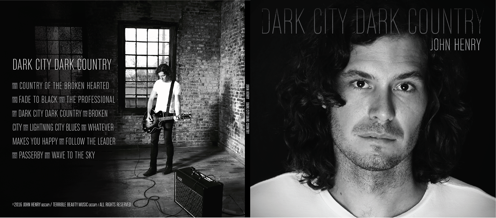
“Dark City Dark Country” is an album released in 2016 by St. Louis musician John Henry. This project was a collaborative effort with my ace pal and nationally-known photographer, Nate Burrell, who provided the portraits used in the design.
The two of us brainstormed ideas based around the theme of the album, which uses textures of alt country and Springsteen-esqe keys paired with heartfelt lyrics to evoke feelings of loss, love, regret, and hope. This is heady, earnest stuff.
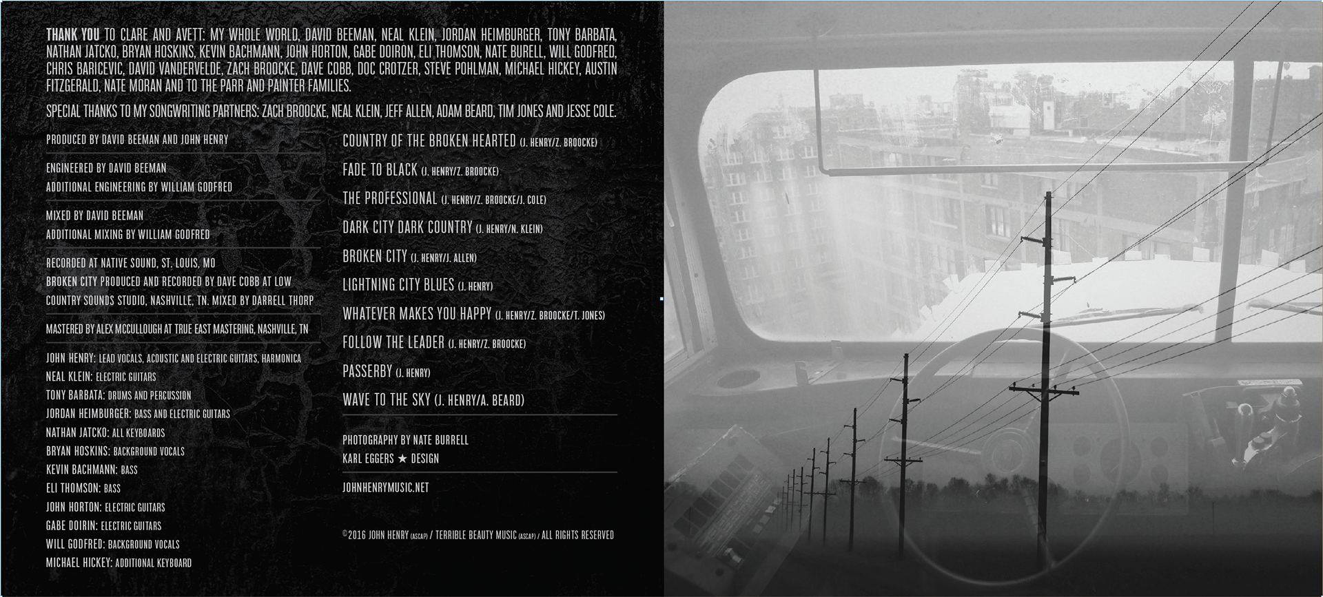
My goal as a designer was to play off of this feeling of urban decay, which required a modern aesthetic and an element of tension. I sprinkled textural elements throughout the piece, and employed them to help put the viewer into the headspace of John as he put together this album. Images are presented in black and white, and on the back cover I divided the image into a stark light and dark heaven/hell symbolism using an organic ink splatter texture. On the inside a multiple exposure of a bus falling off of a building from the driver's point of view is contrasted with an almost solid black texture of cracking paint. The typography is condensed and tight, which adds to the overall emotion of the piece.
As a point of contrast, we made the CD face in color to help show the ray of hope that is at the heart of John's songs on this album. I thought it was a fun visual play to crop the photo so John is looking at the type on the right side.
I really enjoyed this collaboration with Nate and the opportunity to work on John's album. I would highly recommend checking it out.