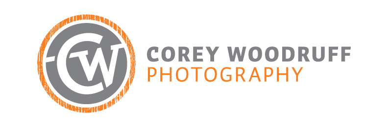
My good friend Corey Woodruff commissioned me to create a logotype for his photography business. Part of the requirements of the project included that it would need to be used as a watermark on all of his images, as well as incorporate the color orange to tie into his previous branding. Given these parameters, I created a mark using Corey's initials and added a wood-like texture to the border as a visual pun. I chose the circle container because of the interaction of with the circular form of the C and its resemblance to the copyright symbol.